Williams Sonoma Inc.
Designing flexible templates to accommodate thousands of home & kitchen items
The problem
The product image page (PIP) is a critical part of the end-to-end browse & buying experience. All WSI brands (Williams Sonoma, west elm, Pottery Barn, Rejuvenation and Mark & Graham) share the same underlying infrastructure — but their needs are not one-size-fits-all. We needed to create a small set of PIP templates that would be effective and flexible enough to to provide a better shopping experience across a huge range of products, painpoints & user needs.
"How much is shipping??"
"I need to be able to visualize this in my home."
Final designs (process below)
Final designs often appear simple, but the process is not. How did we get here?
FIRST
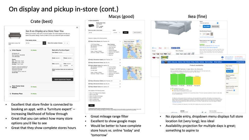
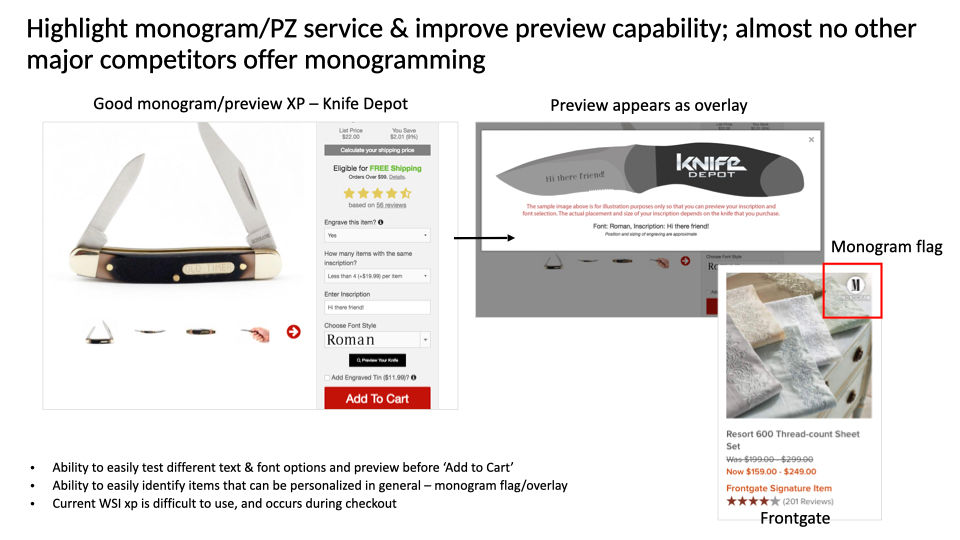
Auditing the competitive landscape to identify feature gaps & improvments
The e-commerce space is a crowded one. I started this project by doing a thorough analysis of the competitive landscape — paying close attention to features others were offering that we weren't, experiences & interactions that were working better than our own, and other gaps in experience that no one was offering. Many times in design I do not believe in fully re-inventing the wheel, familiarity can be a powerful force behind good design. We wanted to understand the 'best' of what was out there, as a place to start ideating, adapting, and experimenting from.
AND
Collecting user feedback via OpinionLab & shopper interviews
Additionally, there was also a ton of rich user feedback to collect in OpinionLab. This feedback began a long improvements/opportunity checklist, actioning us towards the importance of things like conveying shipping costs upfront, and clearly demarcating out-of-stock fabric swatches to not lead users down paths of disappointment. We were also able to conduct user interviews to host more in-depth dialogues around browse & buying behaviors. In terms of top decision making factors when shopping, there was a strong consensus around the importance of: price, size, style, and shipping/availability.

THEN
Defining high-level PIP templates based on image size & attribution complexity
Sometimes it's best to zoom out first. What are the most basic, core elements of the page required for it to be functional? Doing this helped us to see what variations were necessary across templates, with image size and attribution complexity becoming the clear sticking points. While big imagery was essential for shoppers when buying a sofa, a single kitchen spatula couldn't fill that same space without looking lonely and awkward. Likewise, that custom sofa with size, fabric, fill & leg style options needed a lot more space and interaction refinement than a pillow with two color choices.
NEXT
Designing, refining & iterating on templates and attribution experiences
Our PIP templates went through a lot of iteration, as we continued to identify new challenges with certain product categories, come up with new design patterns, and improve our work through usability testing. Regardless of the template, we approached designs modularly. Our biggest design challenge came with custom furniture. Fitting hundreds of options into limited real estate, while feeling intuitive and not overwhelming, took some time to iron out.
LAST
Developing full page schematics & annotations for development
Once final templates were defined, I put together the following schematics to hand off to development. Defining page components, behaviors, and the purpose behind each 'area' was critical to accompanying our prototypes, since these templates were to be applied to thousands more products than we could visually illustrate.
Final thoughts...
This was a complex and fulfilling project, with widespread impact. Since the UX team at WSI operates outside of the brands, the next step of this work was delivering the templates to each brand for visual styling. Every WSI brand has a different way of operating, from a business and product standpoint. One of the benefits and intentions behind the modularity of the new designs, was so brands could implement pieces here and there before transitioning to new full-page layouts. Continued learning was expected to be the journey forward.


