CVS Health
Designing a new gateway to all patient care at CVS Health
The problem
Health services at CVS span multiple business units, with separate digital teams supporting each one. These sprawling services leverage four different scheduling flows, with many more isolated resource pages to accompany each one. This is terribly confusing for patients seeking care, who don’t perceive any difference between CVS MinuteClinic, CVS Pharmacy, COVID-19 testing or Optical Care. This new landing page aimed to unify the organization with a patient & services first approach.
"Our goal is to position CVS as the leading Health Services provider by giving consumers easy digital access to our full range of innovative care and wellness options."
Final designs (process below)
Final designs often appear simple, but the process is not. How did we get here?
FIRST
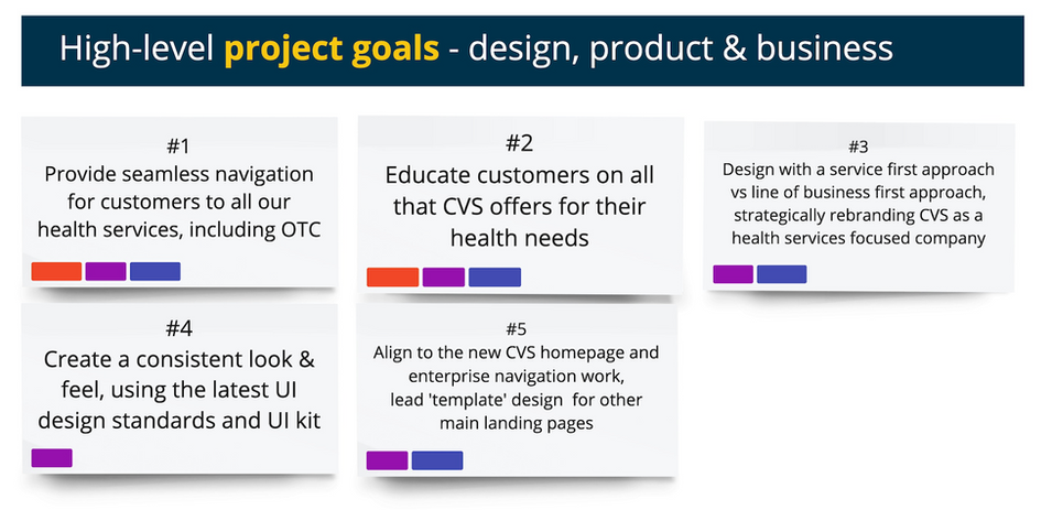
Establishing a shared understanding of project goals & scope
One of the challenges surrounding this project was the amount of internal stakeholders that needed to be included and united. My solution for this was heavy documentation, and making sure the project started off with a clear, shared vision of what we were setting out to accomplish.
NEXT
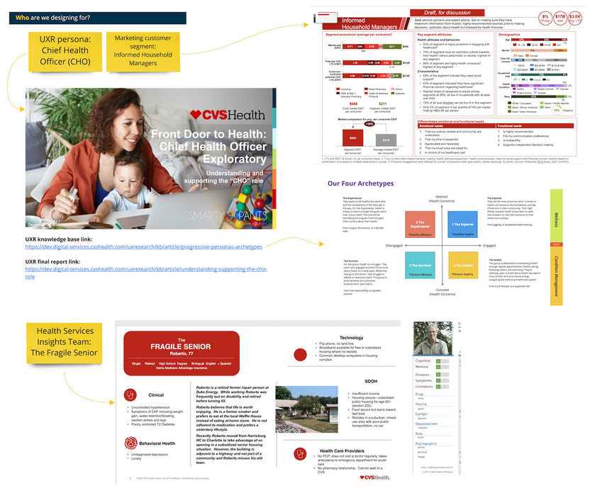
Who are we designing for?
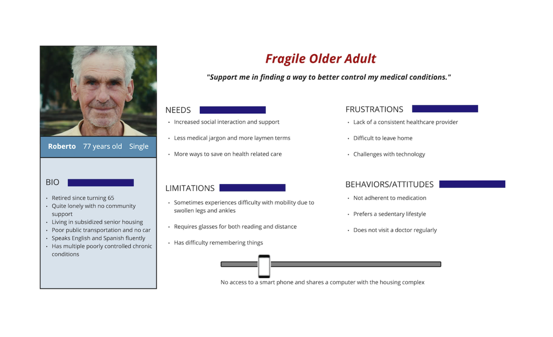
After getting our stakeholders aligned, my UX researcher and I combed through our existing research library and worked with our marketing team, to define two main personas. In addition to informing design decisions, participants were recruited for every study related to this work representing both “Chief Health Officer” and “Fragile Senior” personas.
AND ALSO
Aggregating & ranking core health tasks across the organization
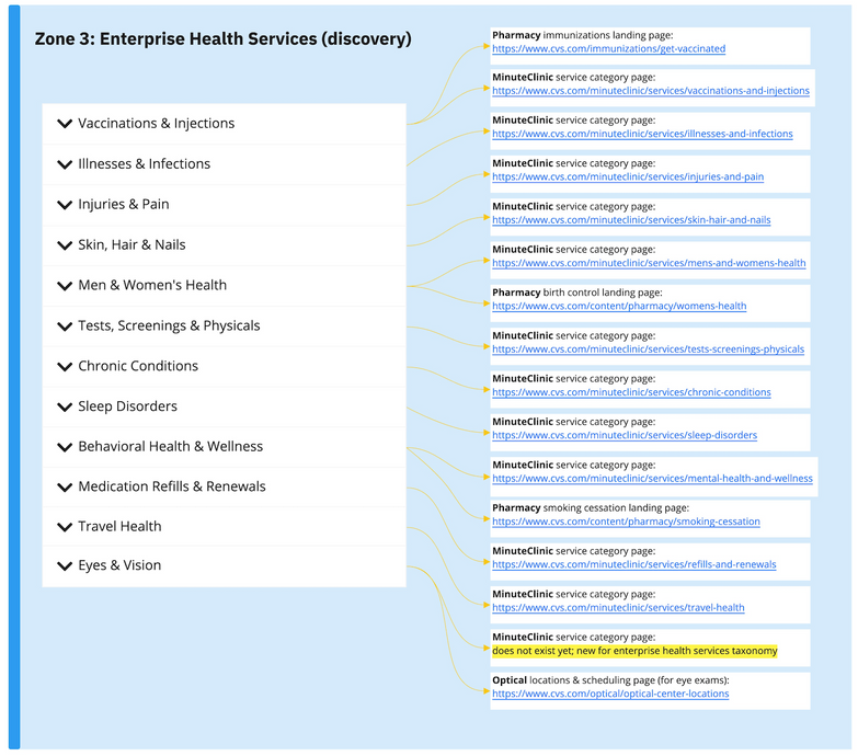
I collaborated with designers at CVS to develop a comprehensive view into all the digital health services & experiences we offered. This was an important step towards understanding what the new landing page would need to support and connect to in our large digital ecosystem. Afterwards, I consolidated overlapping experiences and ranked core patient health tasks. This helped me establish a hierarchy for the next phases of design & wireframing.
THEN
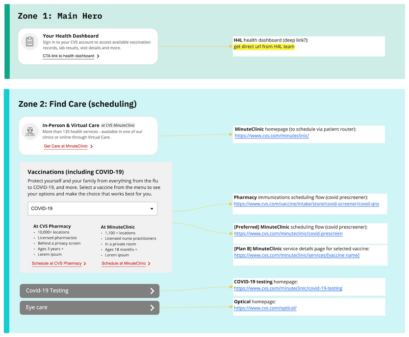
Working out service UX within page zones
This page had a lot of jobs to do. Grouping the content into modular zones proved essential for easier digestibility and scanning. We wanted users to be able to get a broad sense of what was available to them, and hone in from there based on their own individual needs. After the goals and function of each zone was established, there was a lot of UX to work out for patient service routing. The biggest challenge here was addressing services offered by both CVS Pharmacy & MinuteClinic. Since unified scheduling was not an option at this point in time, the next best experience we could offer was allowing patients to select the service they needed, let them know where they could get it, and provide enough details RE the service differences to empower them to make a decision about where to schedule (and then route them there). Some of these key factors were differences in: age requirements, insurance/cost, availability, and who would be treating them (pharmacists vs nurse practitioners, for example).
AND ALWAYS
Testing throughout to learn and adapt
We conducted four studies throughout the design process, led by my UX researcher:
-
The first was an unmoderated study at the start to gage brand trust & perceptions of CVS as a health destination.
-
The second was an unmoderated usability study focused on UX/UI treatments for key problem areas within the design related to service overlaps & business unit branching.
-
The third was a ranking test sent out to hundreds of current CVS users to determine top priorities and decision-making factors when getting vaccinated.
-
And finally, as designs were getting closer to final, 45-minute moderated usability sessions on full-page mockups.
Each study informed design decisions in critical ways, from copy & nomenclature, to component & interaction patterns, and delineating how much information on this page was too much.
Final thoughts...
Designing within the framework and constraints of existing backend infrastructure spanning 4 digital teams, and during a period of serious brand transition for CVS as a health company, posed many great challenges! The work required a lot of planning, a lot of creativity, and a lot of winning people over (for the benefit of our users), and I’m proud of what we were able to accomplish.
Final designs are never really final. This new landing page needs to be released into the wild, where we hope to A/B test different treatments in key areas, move modules around, track user engagement…learn and iterate!


