One redesigned screen drove a 79% increase in Behavioral Coaching enrollment, helping route thousands of members into clinically appropriate, lower-cost care.

Context
Coaching was both clinically appropriate for many members and significantly more cost-effective than therapy — yet enrollment remained low. The enrollment experience wasn't helping members make informed decisions. It was getting in the way of one.
Role: Lead Product Designer
Team: Product Manager · Clinical Program Advisor
Scope: Content Strategy · UX/UI Design · Visual Design
Understanding the decision gap
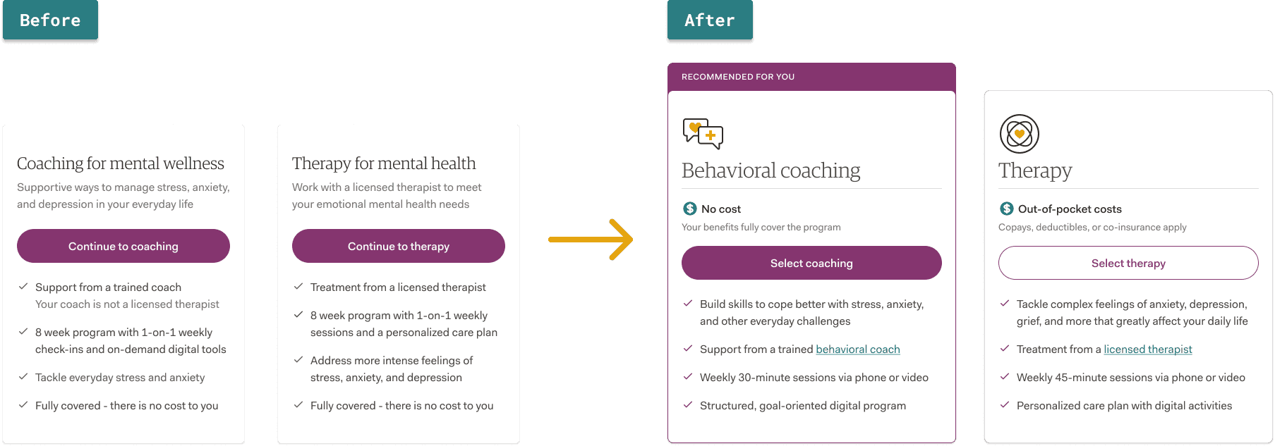
Program names and descriptions felt interchangeable
Members didn't understand what a Behavioral Coach was — or their credentials
Cost differences were not visible early enough
The experience never communicated when Coaching was the recommended fit
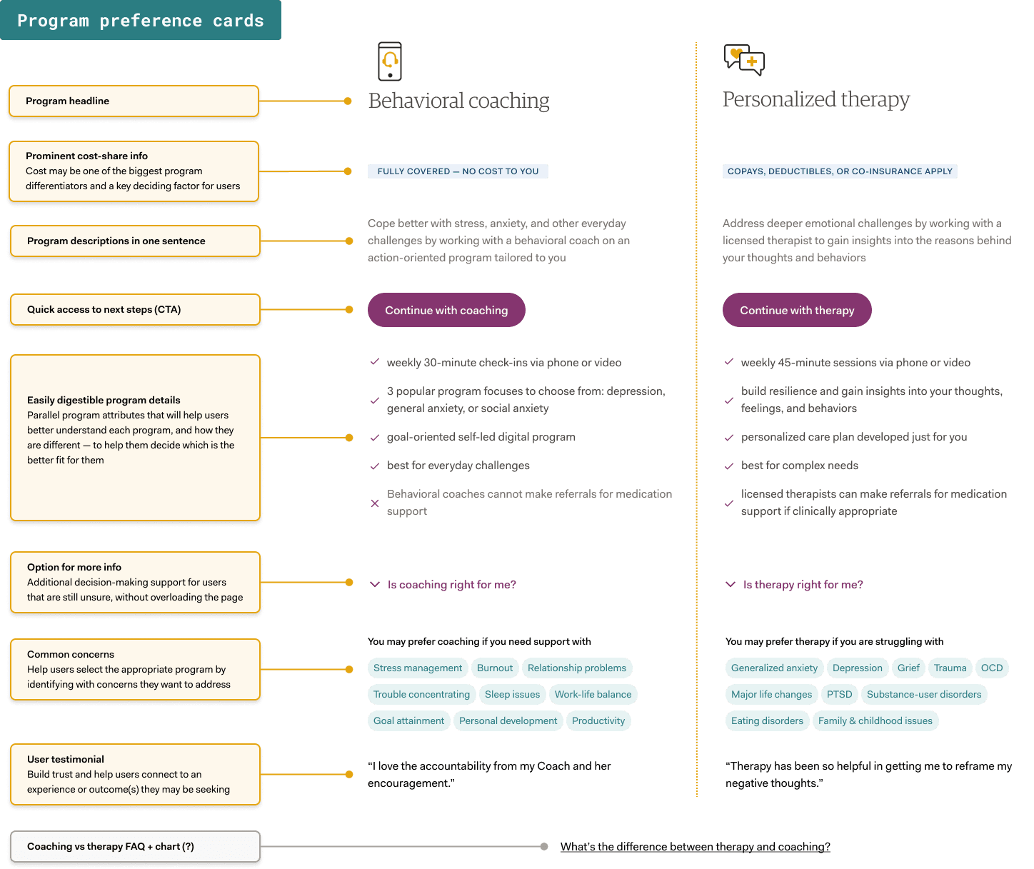
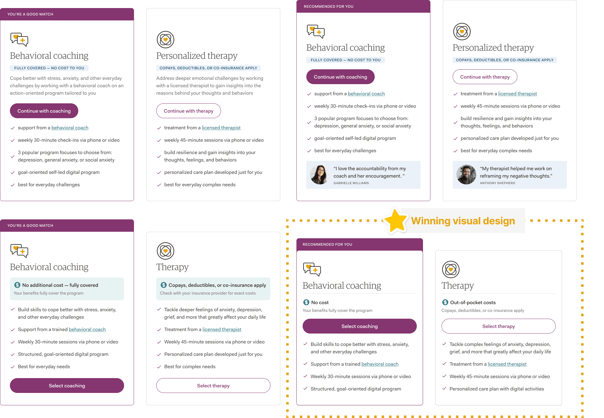
To address these challenges, I explored multiple concept directions, benchmarked comparable experiences, and rethought both the information architecture and content strategy before ultimately arriving at a simpler, more informed program selection experience.
What I designed
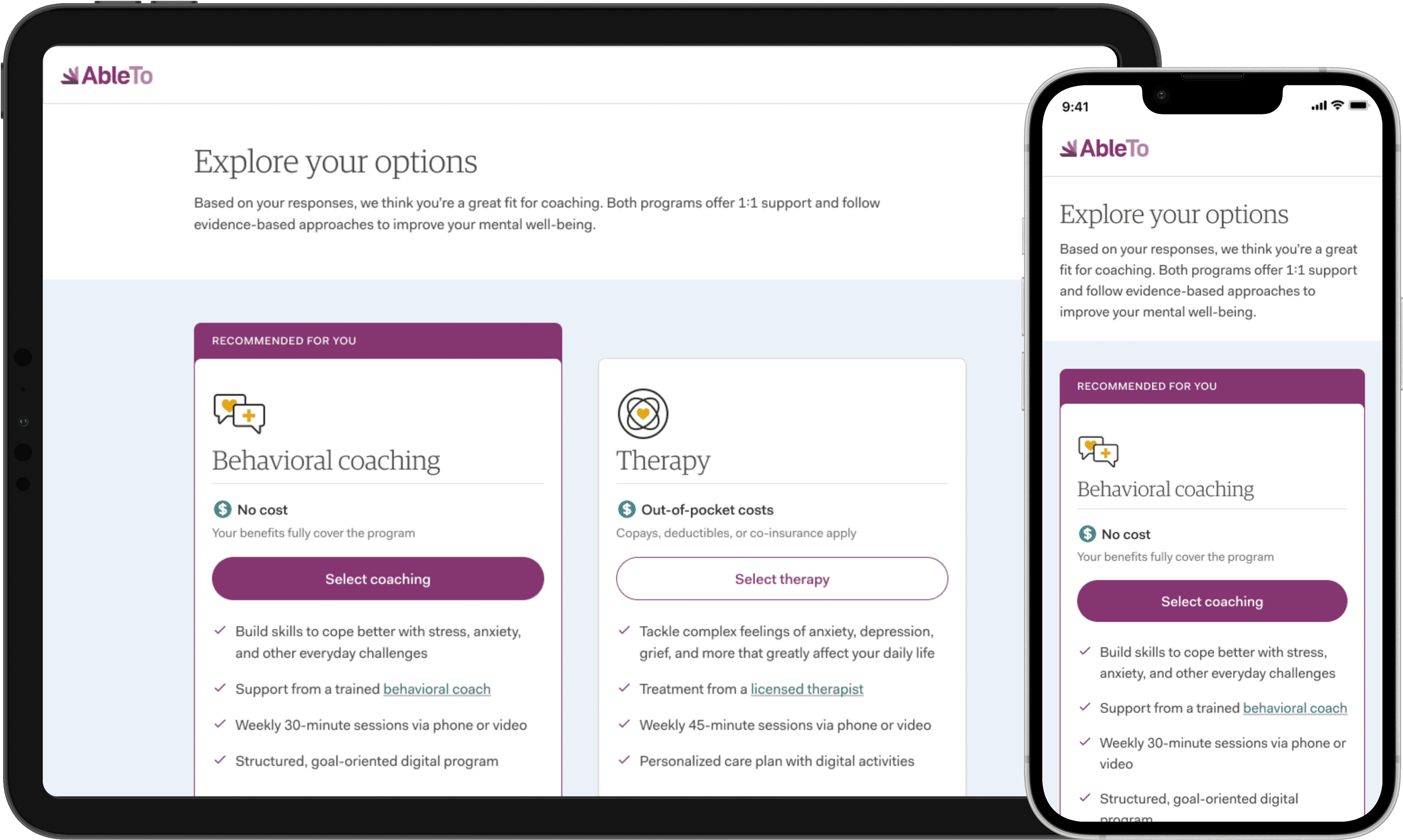
A redesigned program selection card component, built around five key changes:
Prominent cost differentiation: Surfaced as the first visible differentiator, not buried in a checklist
Clinical recommendation: When assessment data supports Coaching, we say so: "Recommended for you"
Clearer program descriptions: Rewritten to describe outcomes, not just format
Parallel scannable attributes: Structured so members could compare programs on the same terms
Provider credentials interaction: Decision support for uncertain members, without overloading the card
Outcomes + reflection
We ran an A/B test that far exceeded our 20% conversion increase target for coaching programs, instead we achieved:
71% relative increase in coaching enrollment for members recommended Coaching
79% relative increase in coaching enrollment for members recommended Therapy — showing that surfacing cost and clarity moves members toward the lower-cost option even when it wasn't the system recommendation
Better program-to-member fit, supporting improved behavioral health outcomes and reduced cost-to-serve for health plan clients
This project reinforced that even small moments of ambiguity can meaningfully impact access to care. In healthcare, clarity is not just a usability improvement — it can influence clinical outcomes, cost efficiency, and whether members receive the right support at all.